The Brick Yard
Hidden away in the outskirts of a northern town, The Brick Yard is an eatery that gave us an opportunity to inhabit some quirk in brand creation. Unexpected it might be, but this place has a loyal following and it’s true to say that with The Brick Yard if you know, you know.

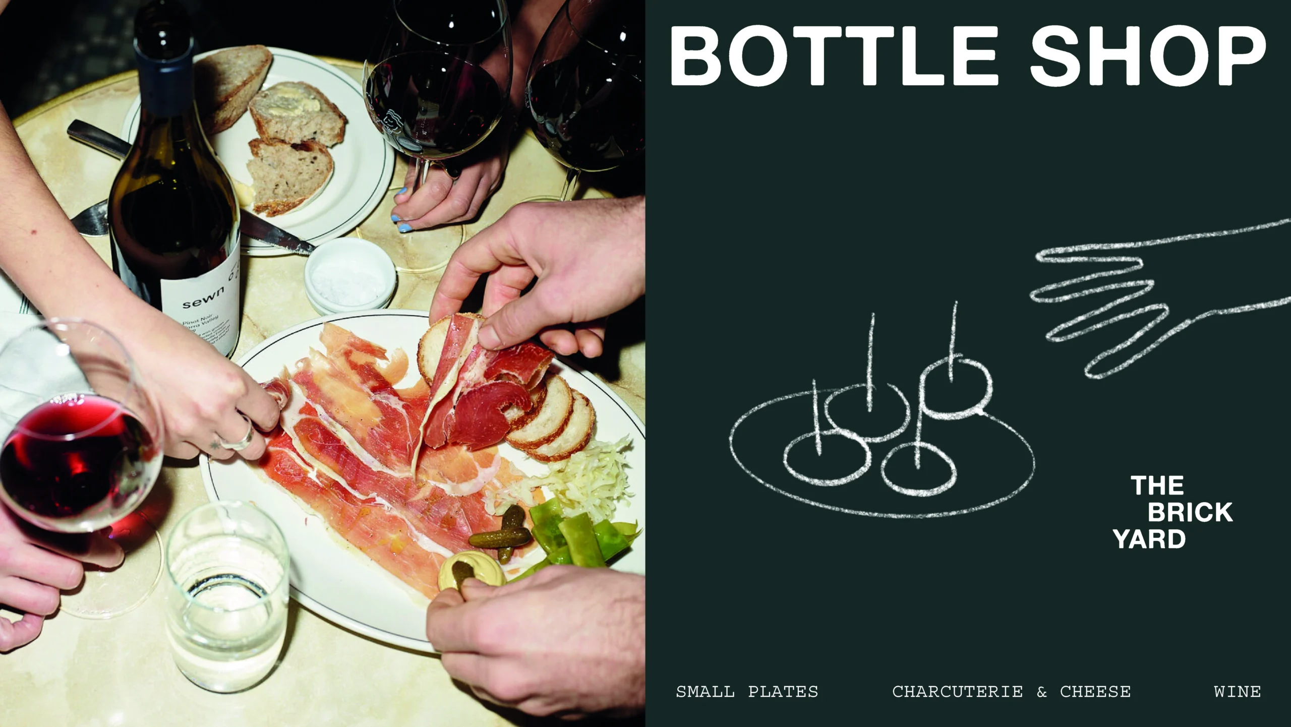
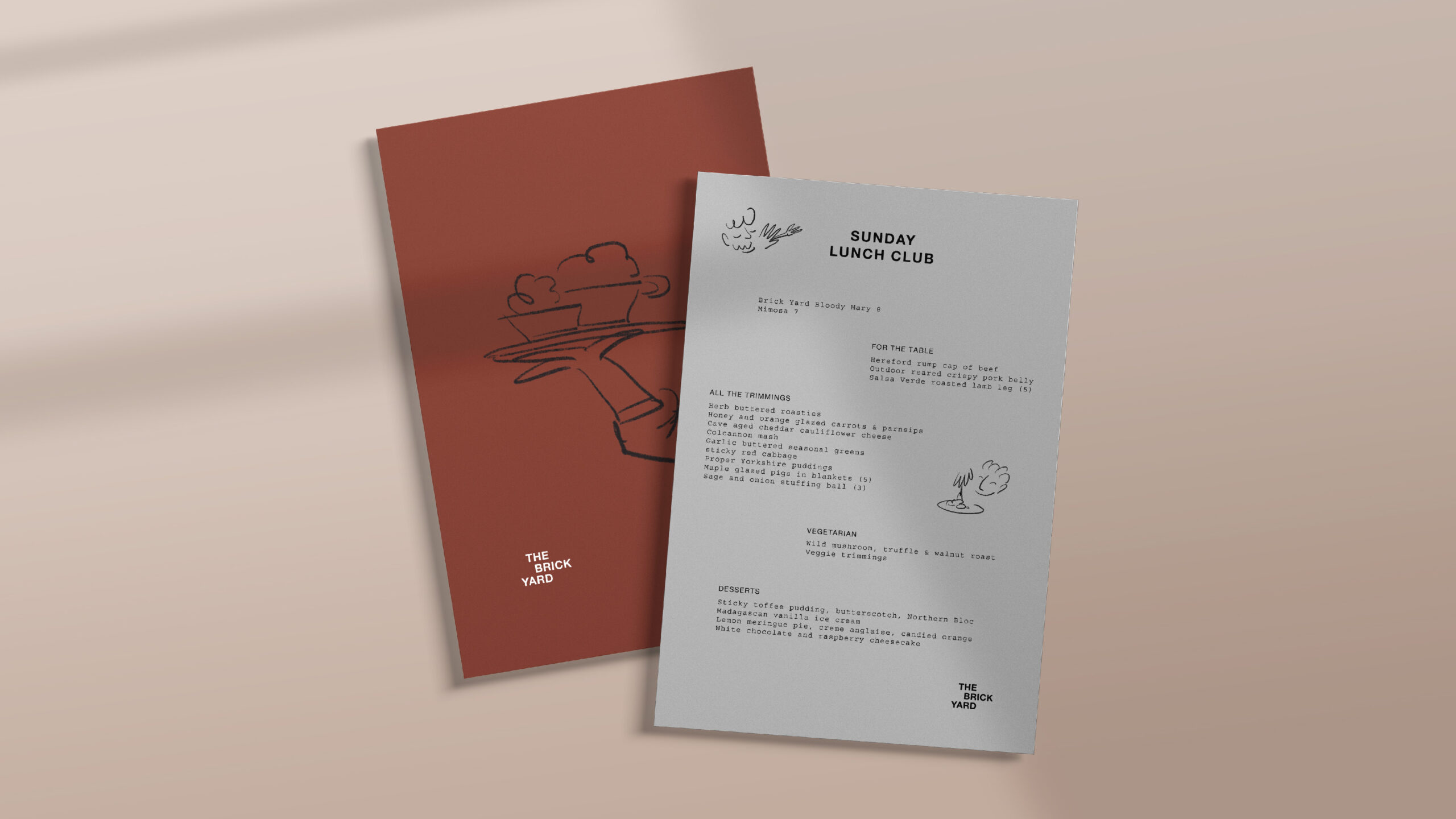
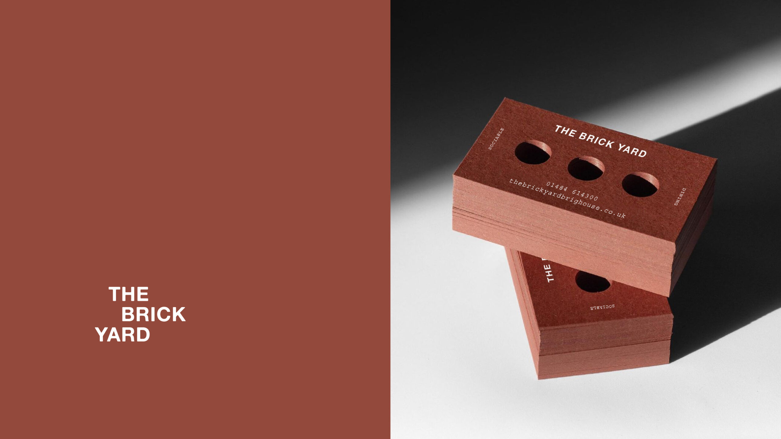
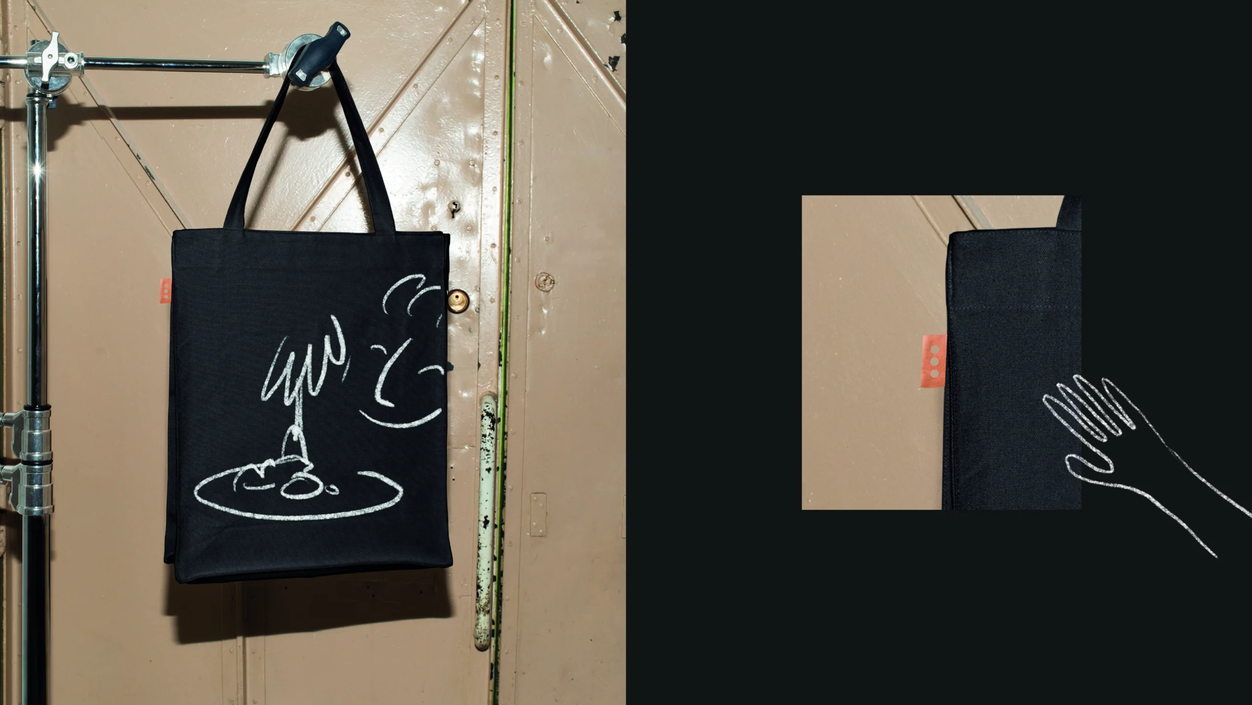
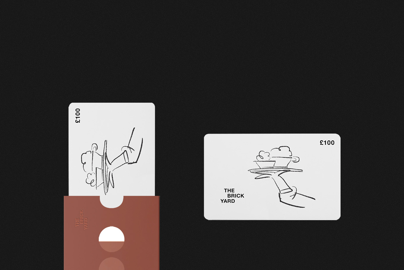
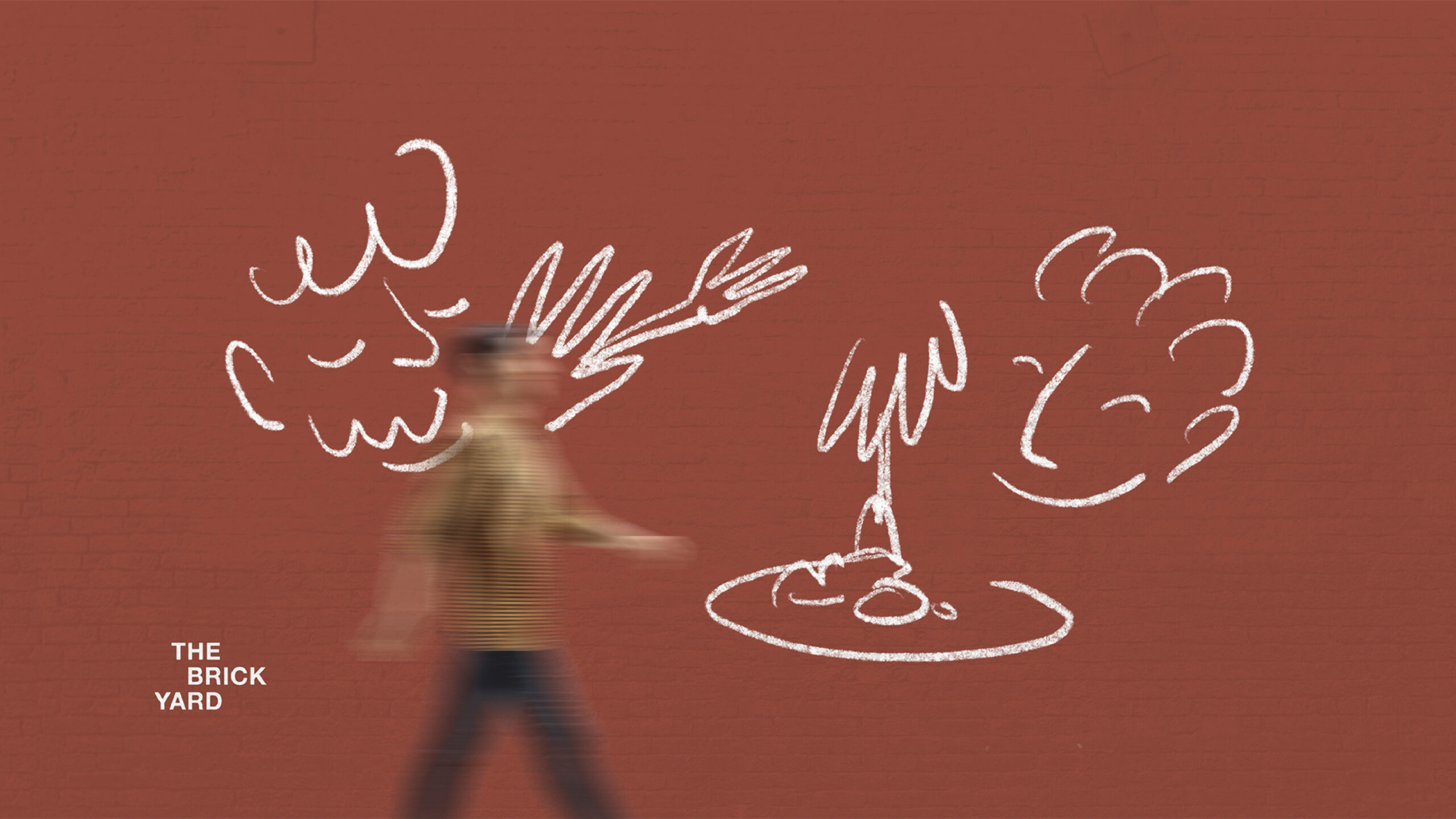
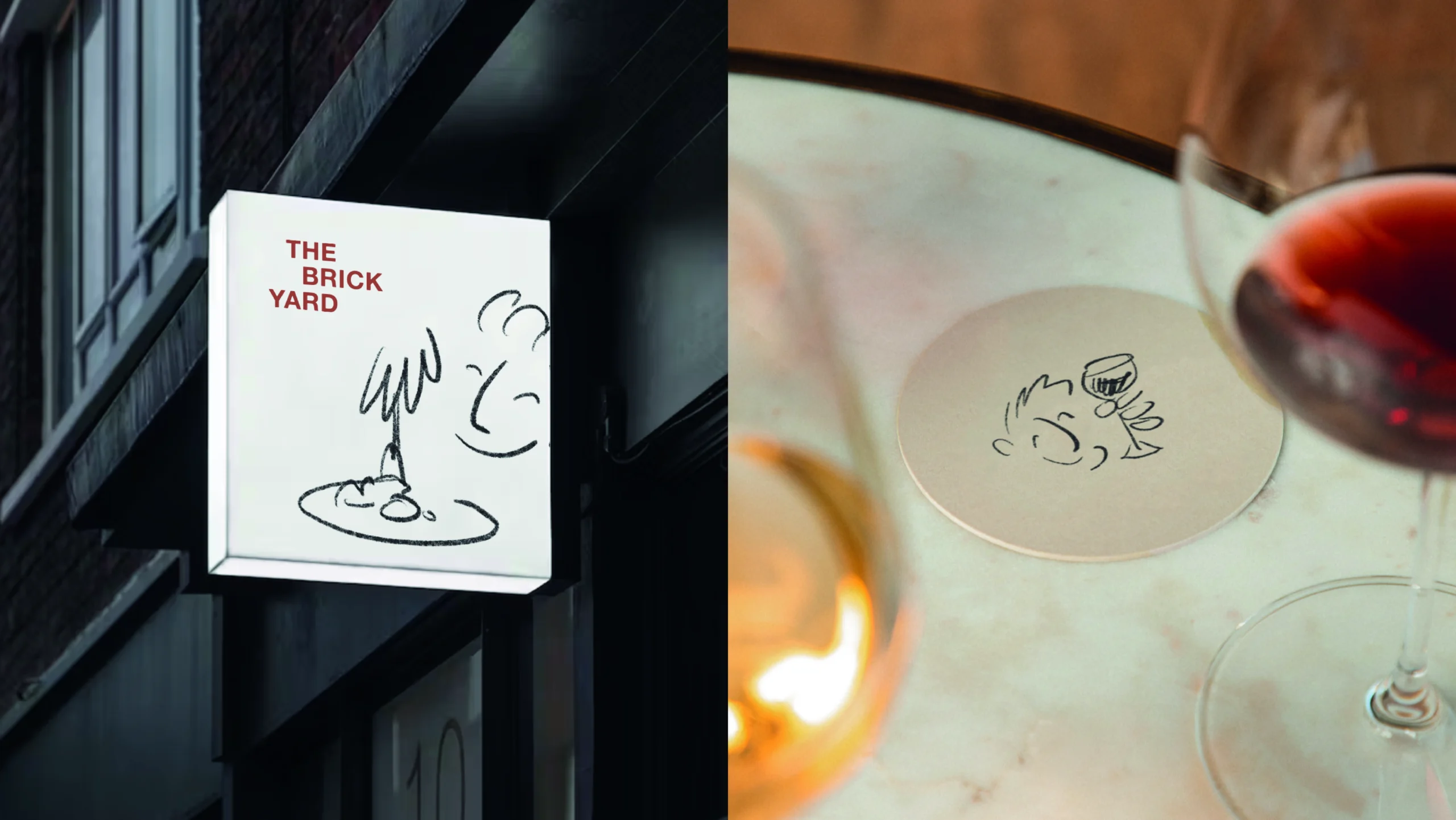
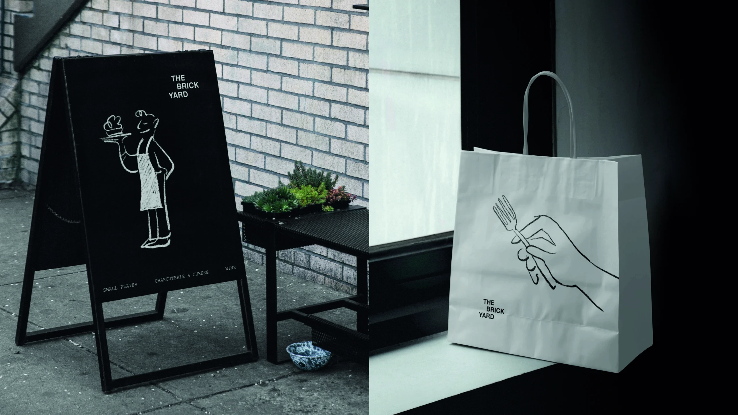
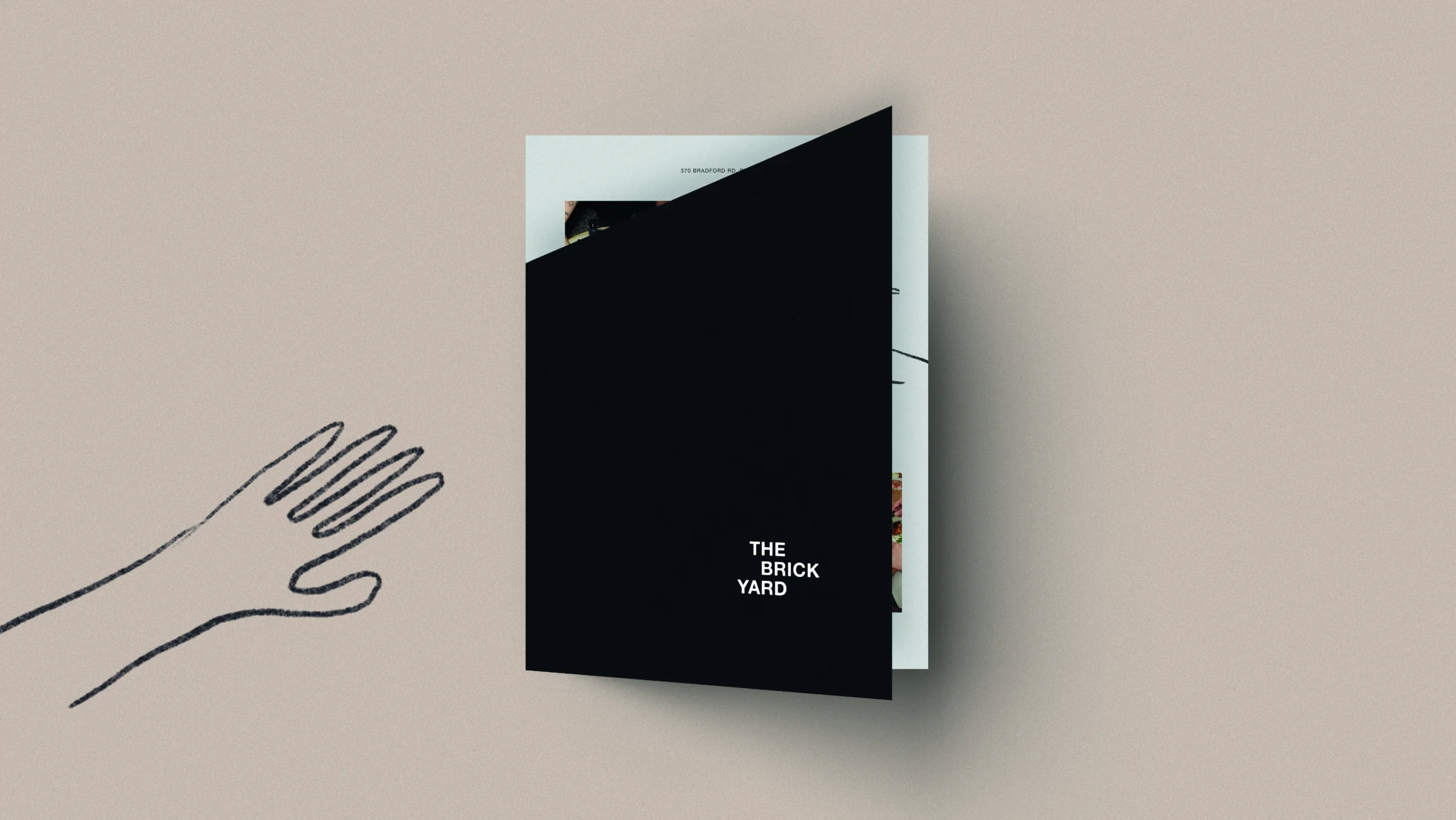
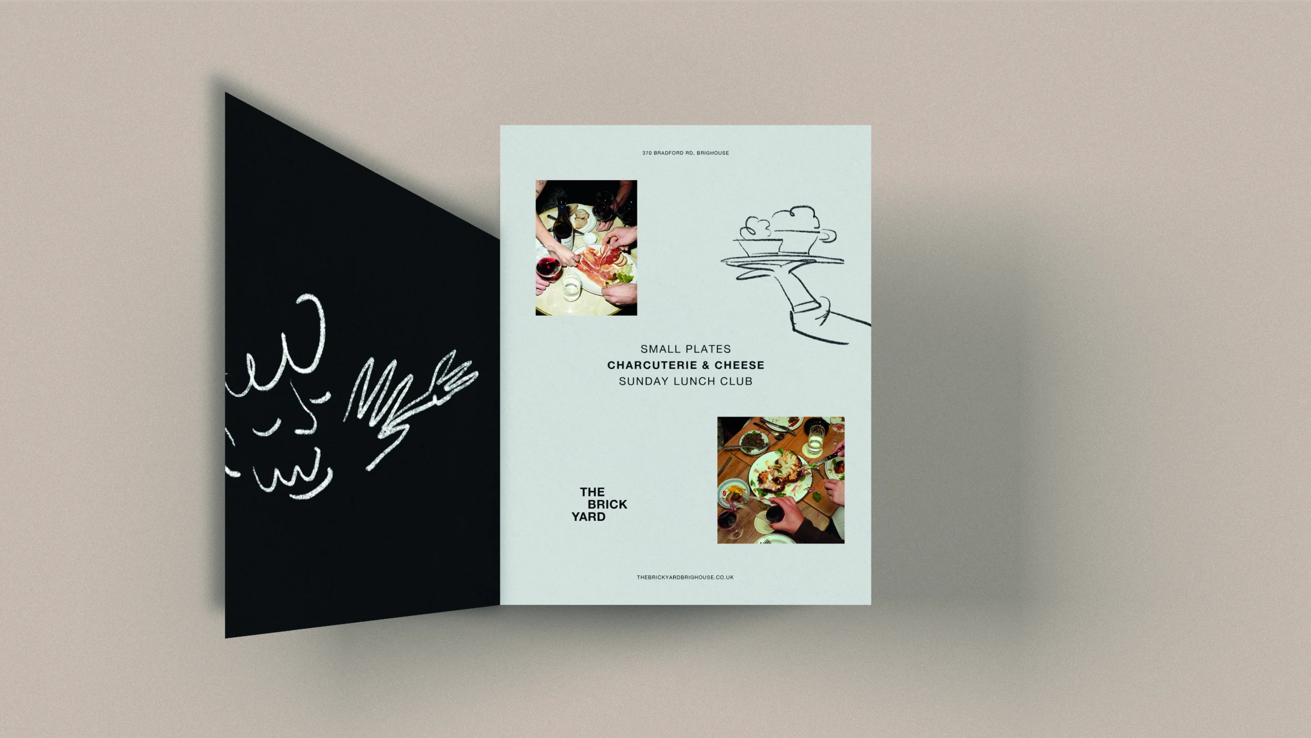
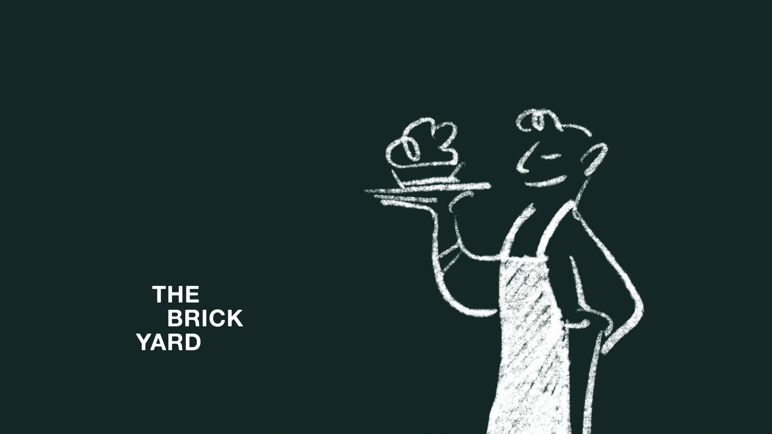
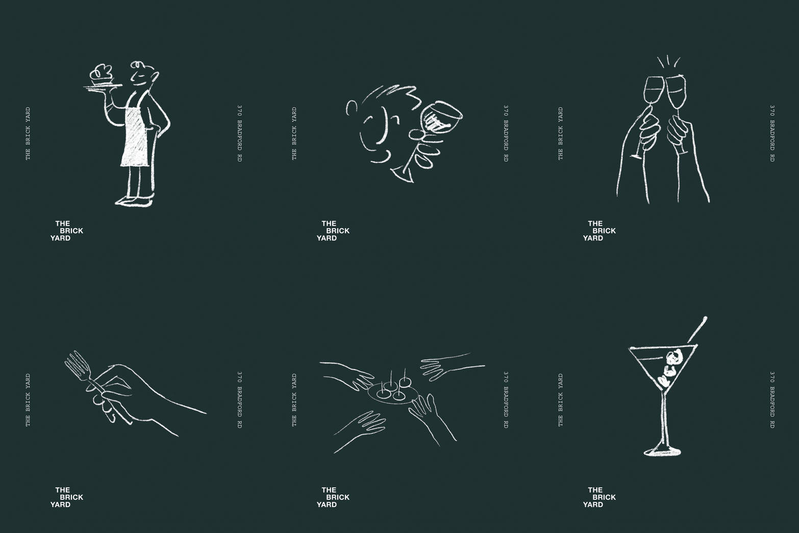
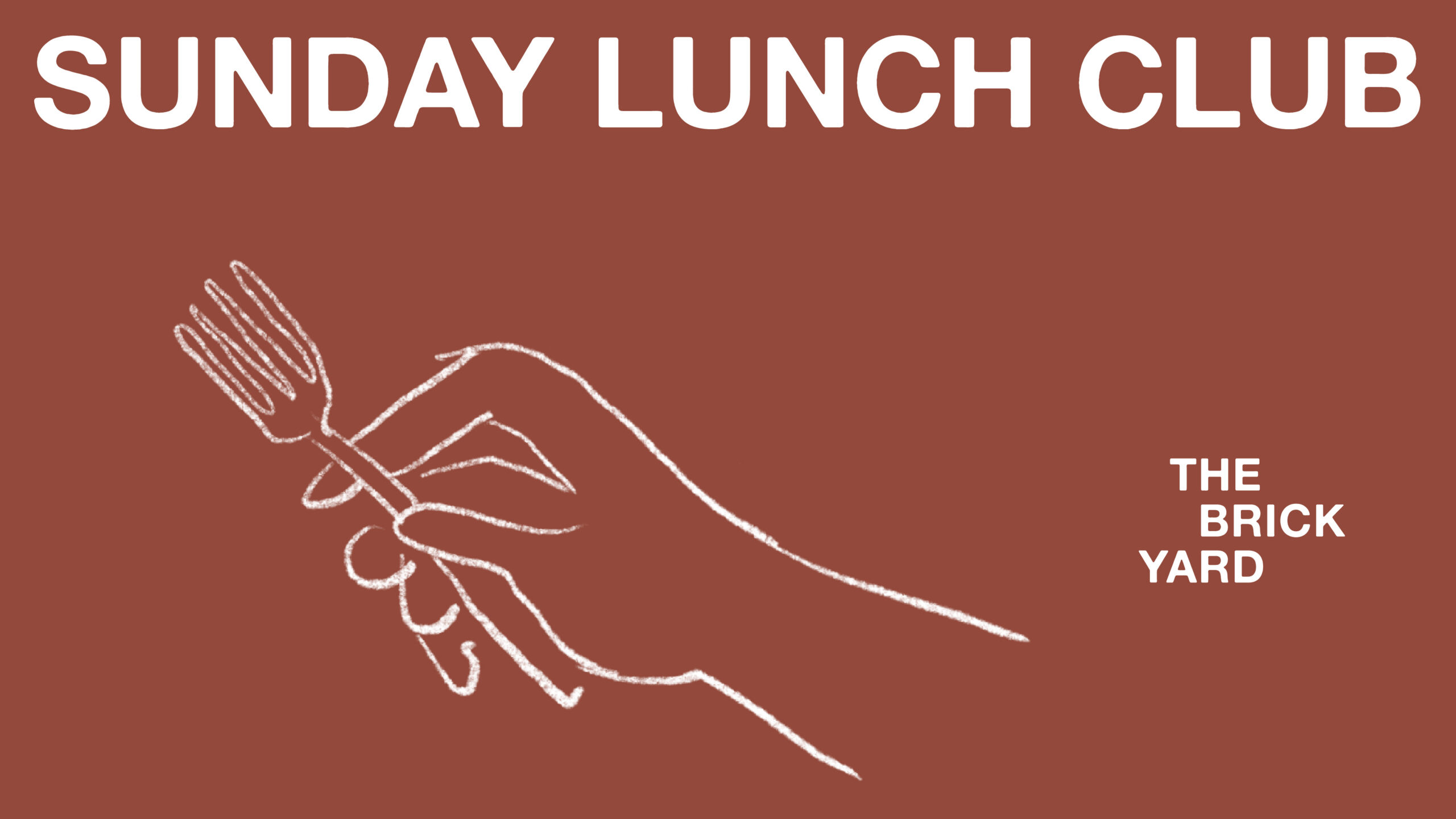
Branding sees a logo identity that feels effortlessly confident. It plays on brick construction layout in synonymy with its name and style of premises. The story comes to life with hand drawn illustrations that deliver tongue-in-cheek simplicity, because the brand is humble, fun, raw and very sociable. The illustrative layer allows for application across the year and is easily applied to create distinctive and memorable messaging.
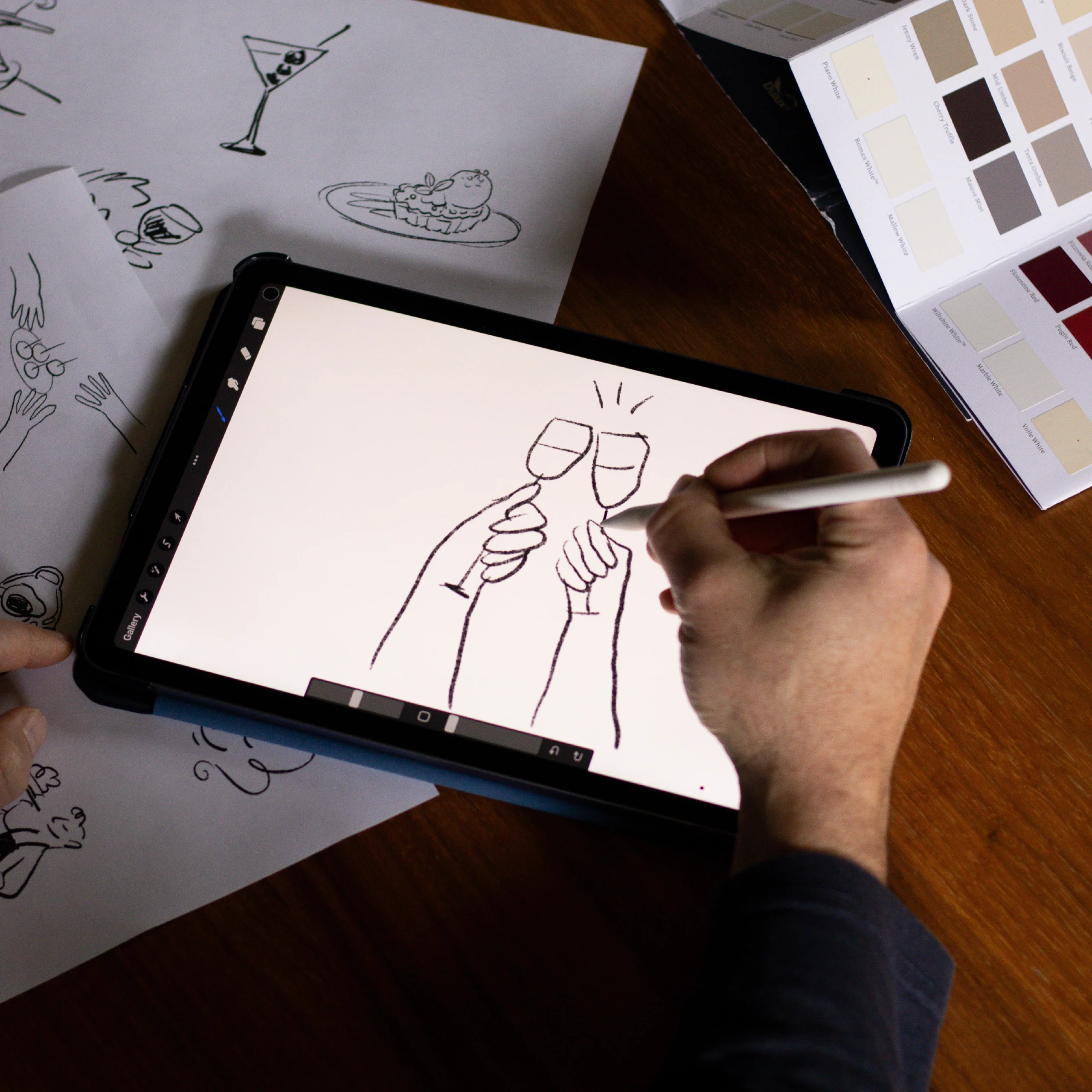
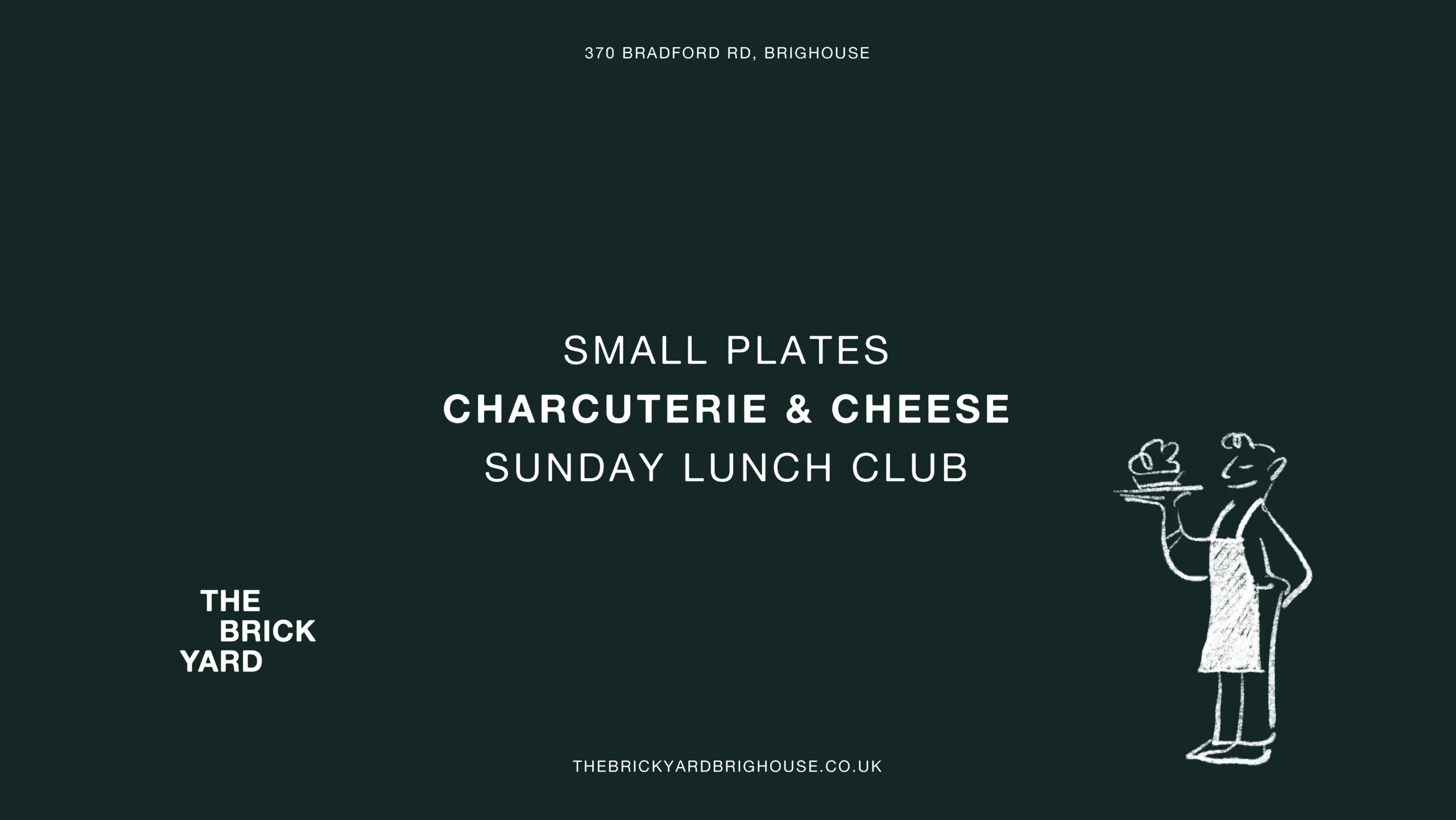
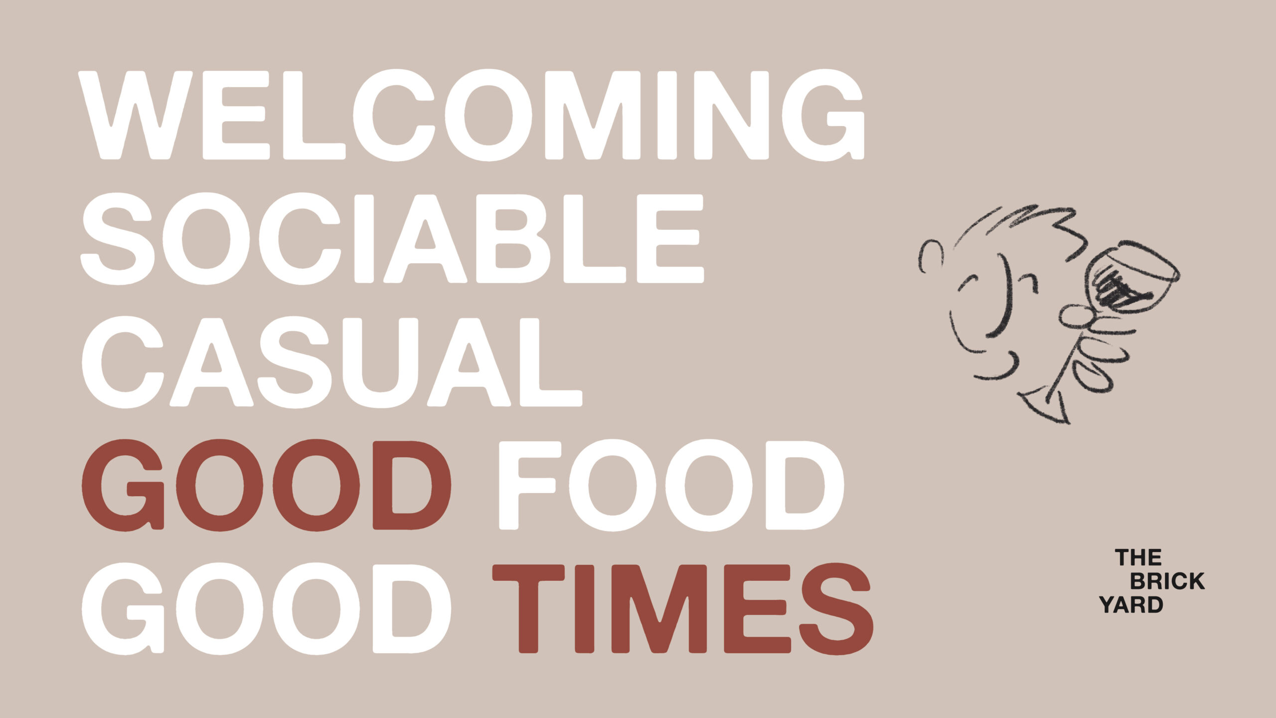
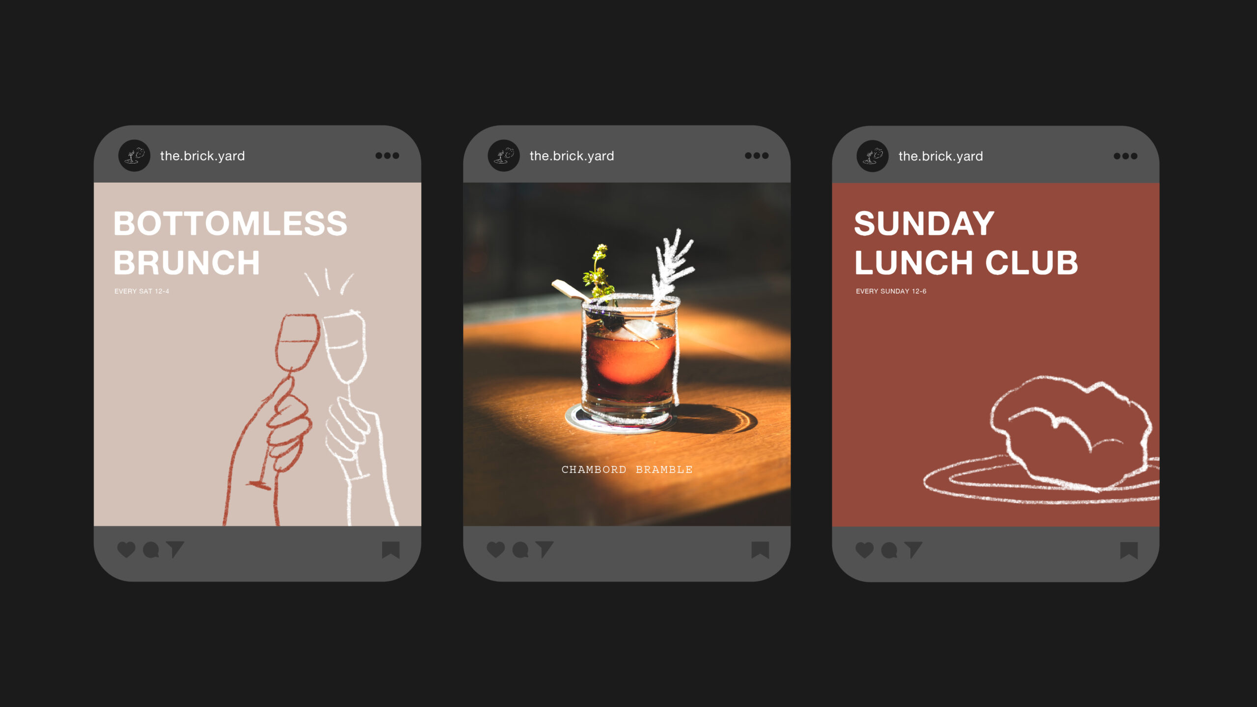
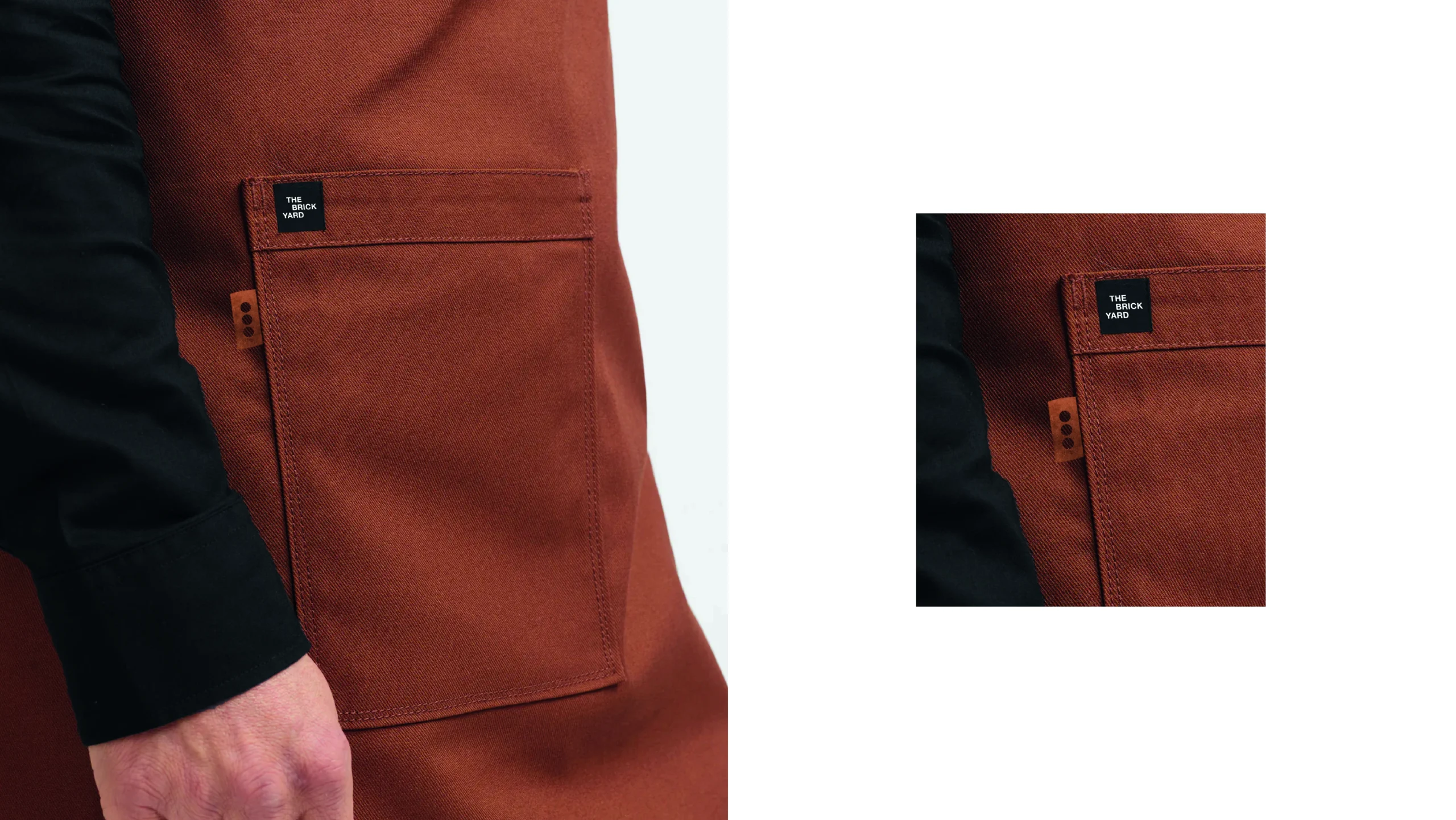
The owners intuitively understand food and hospitality, whilst also possessing a great sense of design, as seen in the industrial style interiors of this stripped back and refreshingly simple space. To complement this, we installed a brand colour palette of uncoated modern neutrals and brick tones, coupled with carefully chosen fonts that remind us of old industry print press.
Finally a photographic tone that feels very real, sociable and ‘in the moment’, rounds off a toolkit that conveys the essence of everything The Brick Yard does incredibly well.
